The color wheel is more than just a circle filled with colors; it’s a tool that artists, designers, and even fashionistas use to create harmony and contrast in their work. From the basics of primary colors to the psychological effects of color choices, understanding the color wheel can transform how we perceive and utilize color in everyday life. Whether you’re picking out an outfit, decorating a room, or just curious about how colors work together, this guide will help you see the full picture of the color wheel.
Key Takeaways
- The color wheel is essential for understanding color relationships, including primary, secondary, and tertiary colors.
- Complementary and analogous colors offer ways to create contrast and harmony in design.
- The color wheel has historical roots and scientific principles that inform its modern-day applications.
- In beauty and fashion, the color wheel helps in selecting makeup shades and creating stylish outfits.
- Interior design benefits from the color wheel by aiding in the creation of balanced and aesthetically pleasing spaces.
Understanding the Basics of the Color Wheel
Primary, Secondary, and Tertiary Colors
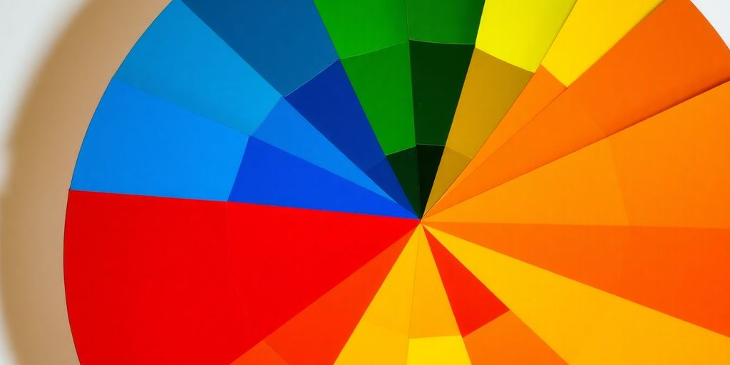
The color wheel is a fascinating tool that helps us understand how colors relate to each other. At its core, the wheel is divided into three main categories: primary, secondary, and tertiary colors. Primary colors—red, blue, and yellow—are the building blocks of all other colors. You can’t mix other colors to create these three, making them unique.
Secondary colors, on the other hand, are formed by mixing two primary colors. So, when you mix red and blue, you get purple; blue and yellow make green; and red and yellow create orange. These secondary colors add more depth to our palette.
Then come the tertiary colors, which are a bit more complex. They’re made by mixing a primary color with a secondary color next to it on the wheel. This gives us hues like red-orange, yellow-green, and blue-purple. Tertiary colors help in creating more nuanced and sophisticated color palettes.
Complementary and Analogous Colors
Complementary colors are those that sit directly opposite each other on the color wheel. Think of red and green or blue and orange. When used together, these colors create a vibrant look because they contrast so strongly. This is why they’re often used to make things pop in design.
Analogous colors, however, are neighbors on the wheel. They usually match well and create serene and comfortable designs. For example, if you’re working with blue, analogous colors would be blue-green and blue-purple. These combinations are often found in nature and are pleasing to the eye.
The Role of the Color Wheel in Art and Design
The color wheel is not just a pretty circle; it’s a powerful tool in art and design. It helps artists and designers choose color schemes that convey the right mood and message. Whether you’re painting a landscape or designing a website, understanding the color wheel can guide your choices and ensure your work looks balanced and harmonious.
The color wheel acts like a map for artists and designers, offering a visual guide to the relationships between colors. By mastering it, you can unlock endless creative possibilities.
The Science Behind the Color Wheel

Historical Development of the Color Wheel
The color wheel has an interesting backstory. It wasn’t just plucked out of thin air; rather, it was a blend of art and science that evolved over time. Sir Isaac Newton, yes, the gravity guy, was the first to arrange colors in a circle back in the late 1600s. He took the spectrum of colors from a prism and mapped them into a wheel. This was groundbreaking because it visually demonstrated the relationships between colors. Over the years, artists and scientists added to Newton’s idea, forming the color wheel we know today.
Color Theory and Its Applications
Color theory is like a set of rules for using color. It helps artists, designers, and even everyday folks understand how colors interact. The theory includes primary colors (red, blue, yellow), which are the building blocks. Mix these, and you get secondary colors like green, orange, and purple. Add a primary to a secondary, and you’ve got tertiary colors. This theory isn’t just for painters; it’s used in fashion, marketing, and even in picking the right color for your living room walls.
The Psychological Impact of Colors
Colors aren’t just pretty to look at; they affect how we feel. For example, blue often feels calming, while red can be energizing or intense. This psychological aspect is why colors are so important in branding and interior design. They can set a mood or convey a message without saying a word. So next time you’re picking out a shirt or painting a room, think about how the color makes you feel. It’s all part of the science behind the color wheel.
Applying the Color Wheel in Beauty and Fashion
Using the Color Wheel for Makeup Selection
When it comes to makeup, the color wheel is like your best friend. It helps you pick the right shades that not only complement your skin but also make your features pop. Understanding complementary colors can make a huge difference. For example, if you have blue eyes, using orange tones can really make them stand out. Here’s a quick guide:
- Cool Undertones: Opt for shades like pinks and blues.
- Warm Undertones: Go for peaches and golds.
- Neutral Undertones: You have the freedom to experiment with almost any color.
The secret to great makeup is not just in the products you choose but in how you use color to enhance your natural beauty.
Color Harmony in Fashion
Fashion isn’t just about clothes; it’s about creating harmony with colors. The color wheel can help you put together outfits that are not only stylish but also balanced. Here’s how you can use it:
- Monochromatic Schemes: Stick to one color in different shades.
- Analogous Colors: Choose colors next to each other on the wheel for a harmonious look.
- Complementary Colors: Pick colors opposite each other for a bold contrast.
Using colors consciously and strategically can evoke powerful emotions, setting the tone for a fashion collection and brand.
Transformative Power of Color in Personal Style
Color can completely change how you feel and how others see you. Want to feel powerful? Wear red. Need some calm? Go for blue. The transformative power of color in personal style is undeniable. By understanding the color wheel, you can:
- Boost Confidence: Wear colors that make you feel good.
- Express Mood: Use different colors to reflect how you feel.
- Create Impact: Choose colors that make a statement.
Color is a tool for self-expression. Don’t be afraid to experiment and see how different colors can transform your style.
The Color Wheel in Interior Design
Creating Harmonious Spaces with Color
When it comes to designing a space, the color wheel is your best friend. It’s not just about picking a color you like; it’s about understanding how colors interact. Colors that sit next to each other on the wheel, known as analogous colors, create a serene and cohesive look. Think about using blues and greens for a calming bedroom. On the flip side, if you want to make a bold statement, complementary colors, which are opposite each other on the wheel, are the way to go. Imagine a vibrant living room with pops of orange against a backdrop of blue.
Complementary Colors in Home Decor
Complementary colors can really make your space pop. They create a dynamic look that draws the eye. Picture a kitchen with warm, earthy tones of terracotta paired with cool, refreshing shades of teal. This contrast not only adds visual interest but also brings energy into the room. A good tip is to use one color as the dominant hue and the other as an accent, like a bold red vase against a soft green wall.
Innovative Uses of the Color Wheel in Modern Design
Modern design often pushes the boundaries of traditional color schemes. The color wheel helps in experimenting with triadic schemes, where three colors evenly spaced on the wheel are used together. This can create a balanced yet vibrant atmosphere. For instance, a children’s playroom might use a triadic scheme of yellow, blue, and red to stimulate creativity and playfulness. The key is to balance these colors throughout the room to avoid overwhelming the senses.
Interior design is not just about aesthetics; it’s about creating a space that feels right. The color wheel is a tool that helps translate your personal style into a harmonious environment. So, don’t be afraid to mix and match, and most importantly, have fun with it!
Advanced Color Wheel Techniques

Exploring Triadic and Split-Complementary Schemes
When it comes to using the color wheel, triadic and split-complementary schemes are game-changers. Triadic color schemes involve three colors that are evenly spaced around the color wheel. This approach creates vibrant and eye-catching combinations. A classic example is the use of red, yellow, and blue. Meanwhile, split-complementary schemes use one base color and two adjacent to its complement. This offers the same level of contrast as complementary colors but with less tension. Imagine using blue with red-orange and yellow-orange for a balanced yet dynamic look.
Seasonal Color Analysis
Seasonal color analysis helps determine which colors naturally enhance your appearance throughout the year. Each season has its own palette. Spring and summer often celebrate softer, pastel hues, while autumn and winter embrace deeper and richer tones. This method isn’t just for fashionistas; it’s a handy tool for anyone looking to refine their style. Whether you’re choosing a new wardrobe or picking out paint colors, knowing your seasonal palette can guide you to make harmonious choices.
Occasion-Specific Color Choices
Different events call for different color vibes. For everyday outings, you might lean towards neutral or subtle shades, but for special occasions, bolder choices can make a statement. Weddings, for instance, might see you opting for soft pastels or elegant jewel tones. On the other hand, a night out might encourage more daring combinations. Using the color wheel, you can tailor your palette to suit the mood and formality of any event.
The color wheel is more than just a tool; it’s a key to unlocking the potential of color in our lives. By mastering these techniques, you can transform any space or outfit into something truly special. Remember, the goal is to create harmony, not just follow trends. So go ahead and experiment—your perfect color scheme is waiting to be discovered.
For more on how complementary colors and color wheels enhance design, check out practical examples and tips that can boost your creative process.
Practical Tips for Everyday Use of the Color Wheel
Matching Accessories with Outfits
When you’re getting ready in the morning, the color wheel can be your best friend in selecting the right accessories. Think about it: your outfit’s color can guide you in choosing complementary or contrasting accessories. Imagine pairing a royal blue dress with a bright orange necklace—a bold choice that makes a statement. Alternatively, you can opt for analogous colors for a more subtle look, like a green scarf with a blue blouse.
Avoiding Common Color Mistakes
We all make mistakes, but when it comes to color, some are more noticeable than others. Here’s a quick list to steer clear of common pitfalls:
- Overmatching: Avoid matching everything to a tee. It can make your outfit look too coordinated and less dynamic.
- Ignoring Undertones: Pay attention to the undertones in your clothing and skin. A warm undertone might clash with cool colors.
- Neglecting Neutrals: Don’t forget about neutrals. They can balance bold colors and tie an ensemble together.
Using Digital Tools for Color Planning
In this digital age, there are tons of apps and online tools to help with color planning. Adobe Color CC, for example, allows you to experiment with different color schemes before you commit. Whether you’re planning an outfit, redecorating a room, or even exploring the role of complementary colors in design, these tools can save you time and help you visualize your ideas more clearly.
Embrace the color wheel as a tool for creativity and expression. With a little practice, you’ll find yourself making more confident and informed color choices every day.
Wrapping Up Our Colorful Journey
So, there you have it! The color wheel isn’t just some fancy circle of colors; it’s a tool that can totally change how we see and use color in our lives. From picking the right shade for your living room to finding that perfect lipstick, understanding the color wheel can make a world of difference. It’s all about experimenting and having fun with it. Don’t be afraid to mix and match, try new combinations, and see what works for you. At the end of the day, color is personal, and it’s all about what makes you feel good. So go ahead, play with colors, and let your creativity shine!
Frequently Asked Questions
What are primary colors?
Primary colors are the three basic colors – red, blue, and yellow – that can be mixed to create other colors.
How do complementary colors work?
Complementary colors are opposite each other on the color wheel. When used together, they create a strong contrast and make each other stand out.
What is a monochromatic color scheme?
A monochromatic color scheme uses different shades, tints, and tones of a single color to create a harmonious look.
How can the color wheel help in fashion?
The color wheel can help you choose outfits that match or contrast well, making your style more appealing and balanced.
What is the role of the color wheel in interior design?
In interior design, the color wheel helps create color schemes that make rooms feel balanced, harmonious, and visually appealing.
Why is color theory important in art?
Color theory helps artists understand how colors interact, allowing them to create visually appealing and emotionally impactful artwork.